Case Study
Trouva Rebrand
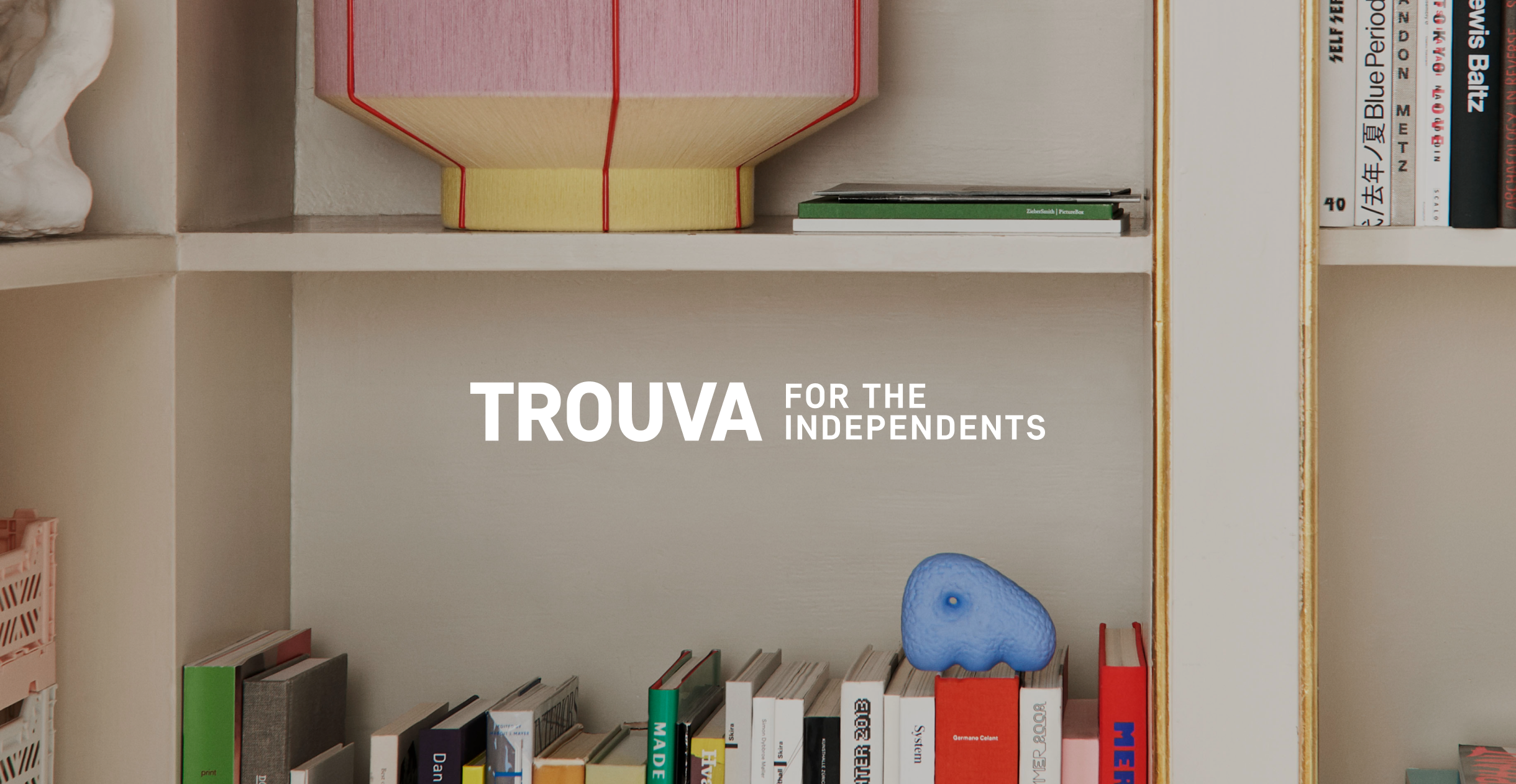
Founded in 2015, Trouva is the leading marketplace to discover independent boutiques and brands.
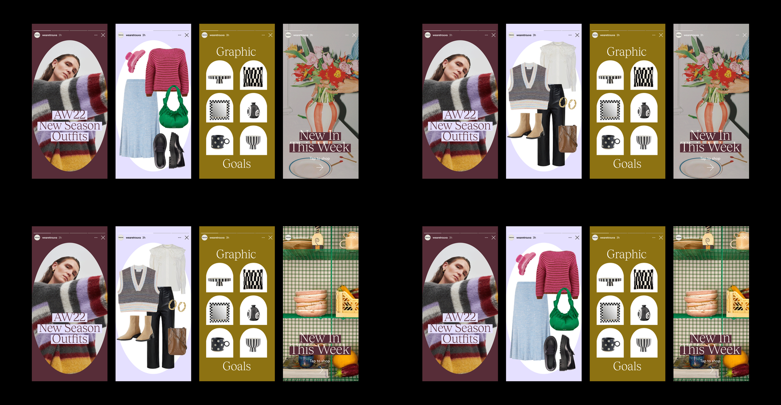
The new visual identity aimed to add personality to every touchpoint of the brand, whilst encompassing a sense of community and creativity. Due to the nature of a marketplace, the visual identity had to be adaptive to multiple brands and also stand the time to compliment seasonal trends.
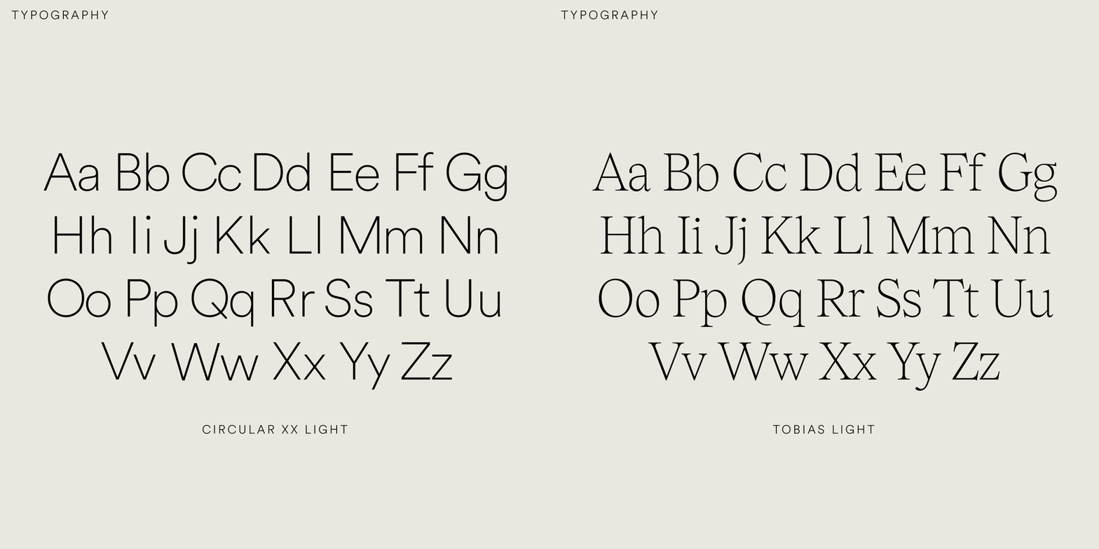
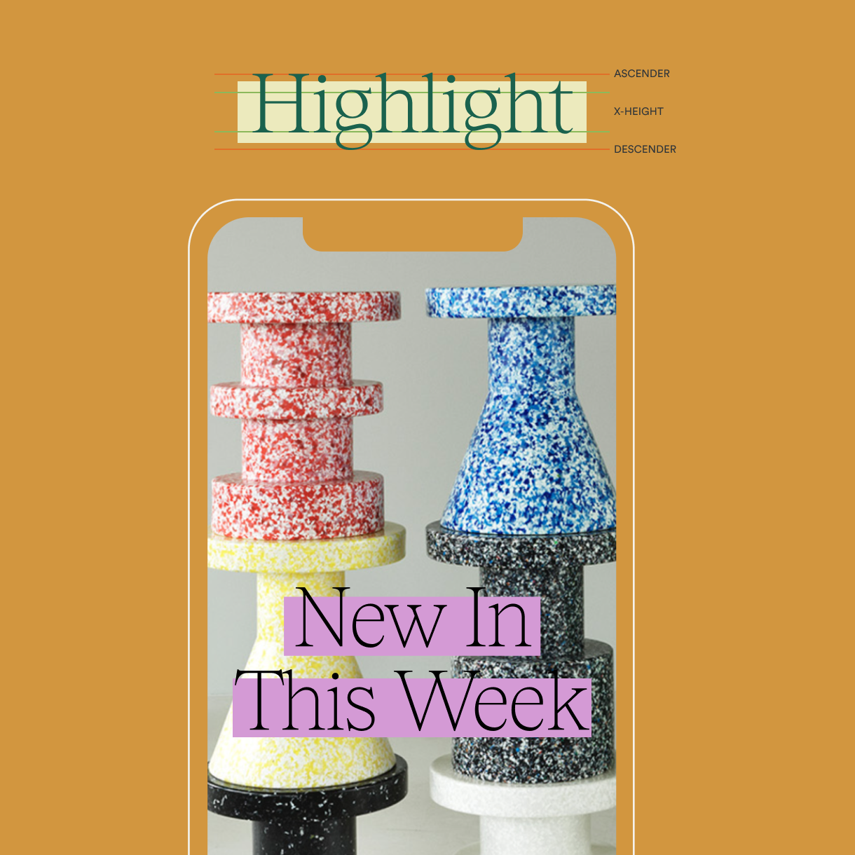
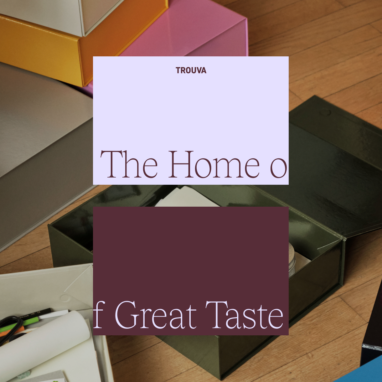
Trouva's origin, 'Trouvaille' meaning 'A lucky find' meant that surprise and delight was at the heart of the rebrand. A bold and confident colour palette, paired with a sophisticated serif, created variation and personality to enhance the brand identity.
Visual Identity
Social & Newsletter templates
Website Design
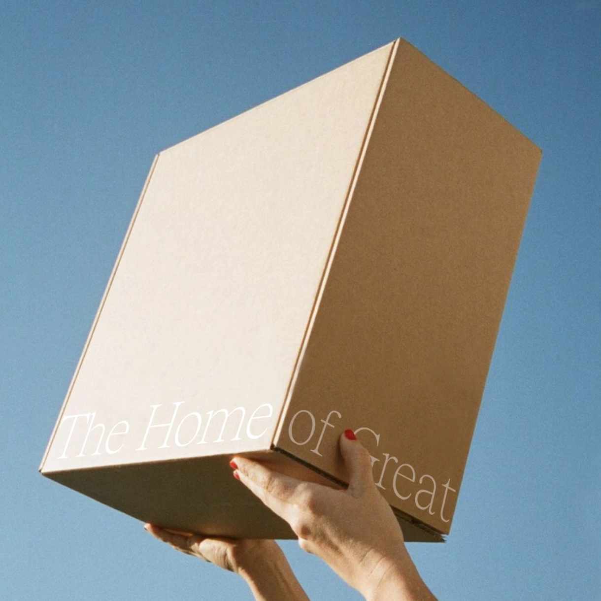
Packaging & printed collateral
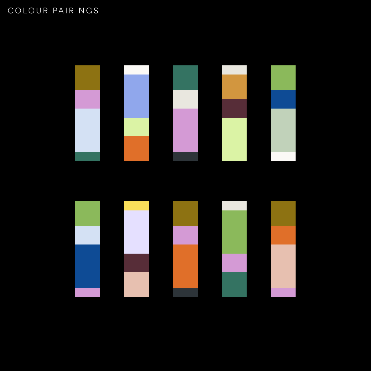
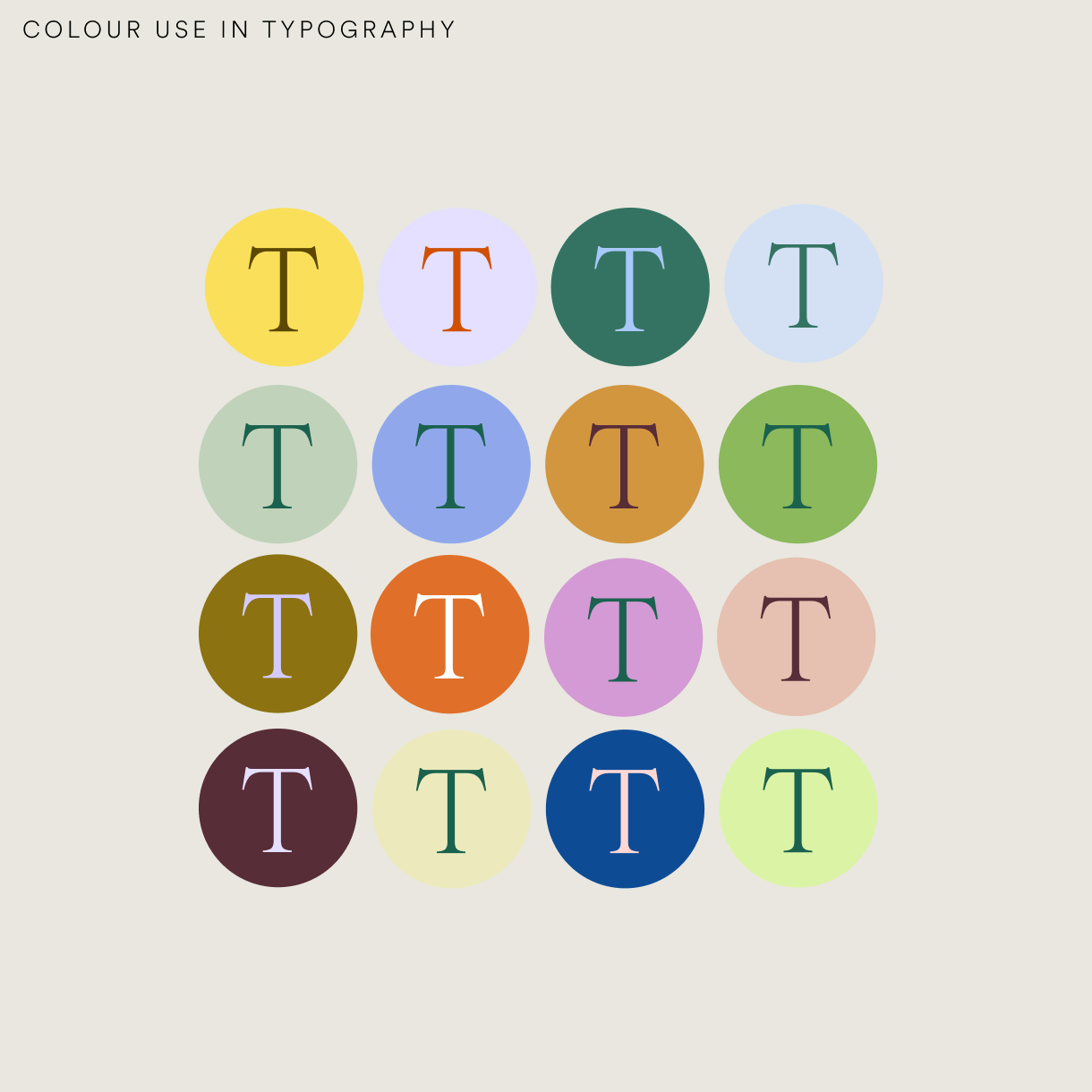
The new visual identity choices are closely tied to the female menstrual cycle, with the four primary brand colours symbolising each phase of the cycle: Mint for the Follicular Phase, Tomato for Ovulation, Blush for Luteal, and Aubergine for Menstruation.
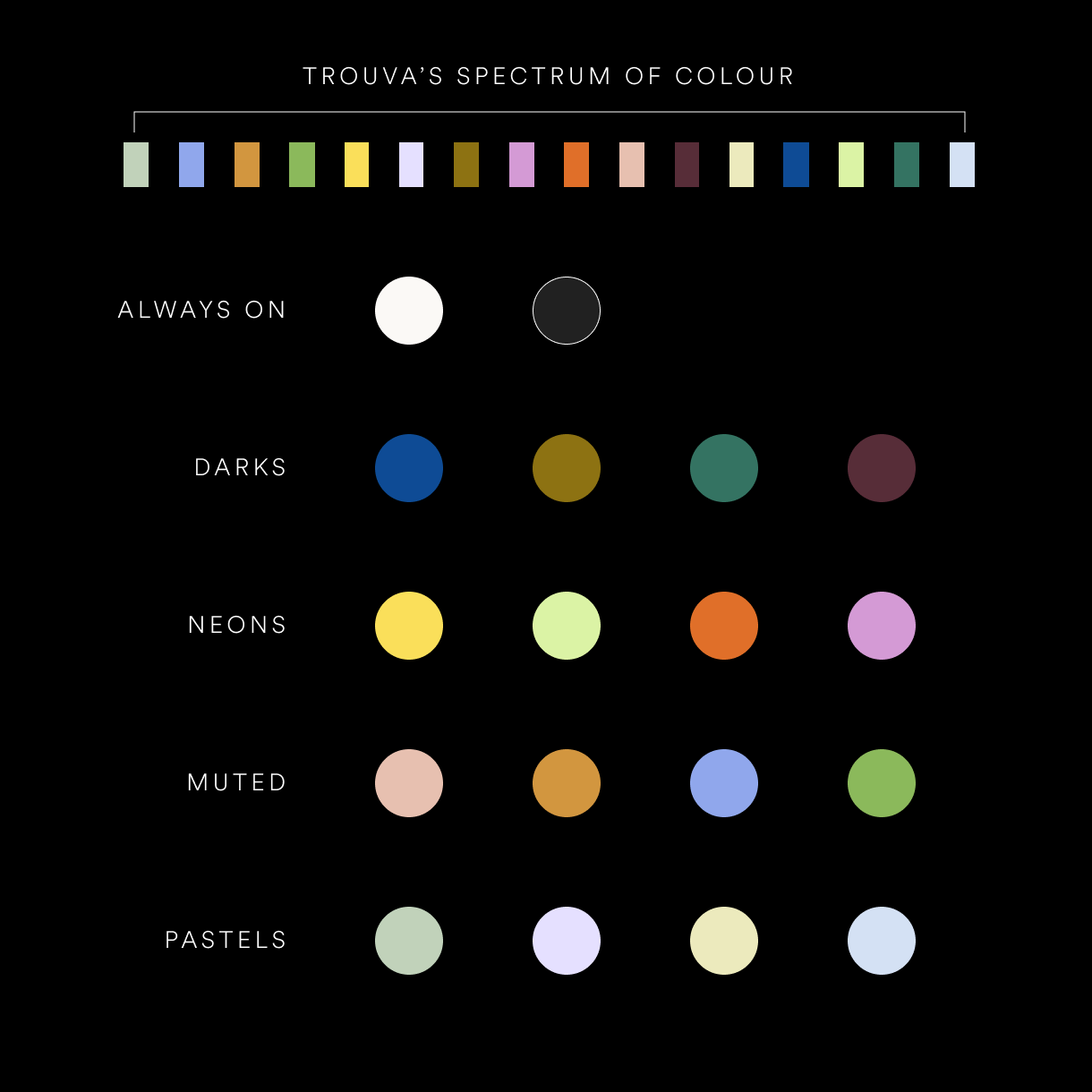
Trouva's spectrum of colour was broken down into 5 categories; Always on, Darks, Pastels, Neons and Muted. The colours were used as accents, and can evolve seasonally.


Let’s connect to see how I can bring your vision to life.


CONTACT
clarissaburridge1@gmail.com
SOCIAL

Case Study
Trouva Rebrand
Founded in 2015, Trouva is the leading marketplace to discover independent boutiques and brands.
The new visual identity aimed to add personality to every touchpoint of the brand, whilst encompassing a sense of community and creativity. Due to the nature of a marketplace, the visual identity had to be adaptive to multiple brands and also stand the time to compliment seasonal trends.
Trouva's origin, 'Trouvaille' meaning 'A lucky find' meant that surprise and delight was at the heart of the rebrand. A bold and confident colour palette, paired with a sophisticated serif, created variation and personality to enhance the brand identity.
Visual Identity
Social & Newsletter templates
Website Design
Packaging & printed collateral

Let’s connect to see how I can bring your vision to life.


CONTACT
clarissaburridge1@gmail.com
SOCIAL


Case Study
Trouva Rebrand
Founded in 2015, Trouva is the leading marketplace to discover independent boutiques and brands.
The new visual identity aimed to add personality to every touchpoint of the brand, whilst encompassing a sense of community and creativity. Due to the nature of a marketplace, the visual identity had to be adaptive to multiple brands and also stand the time to compliment seasonal trends.
Trouva's origin, 'Trouvaille' meaning 'A lucky find' meant that surprise and delight was at the heart of the rebrand. A bold and confident colour palette, paired with a sophisticated serif, created variation and personality to enhance the brand identity.
Visual Identity
Social & Newsletter templates
Website Design
Packaging & printed collateral
Trouva's spectrum of colour was broken down into 5 categories; Always on, Darks, Pastels, Neons and Muted. The colours were used as accents, and can evolve seasonally.

Let’s connect to see how I can bring your vision to life.


CONTACT
clarissaburridge1@gmail.com
SOCIAL
