Case Study
Myoovi Rebrand
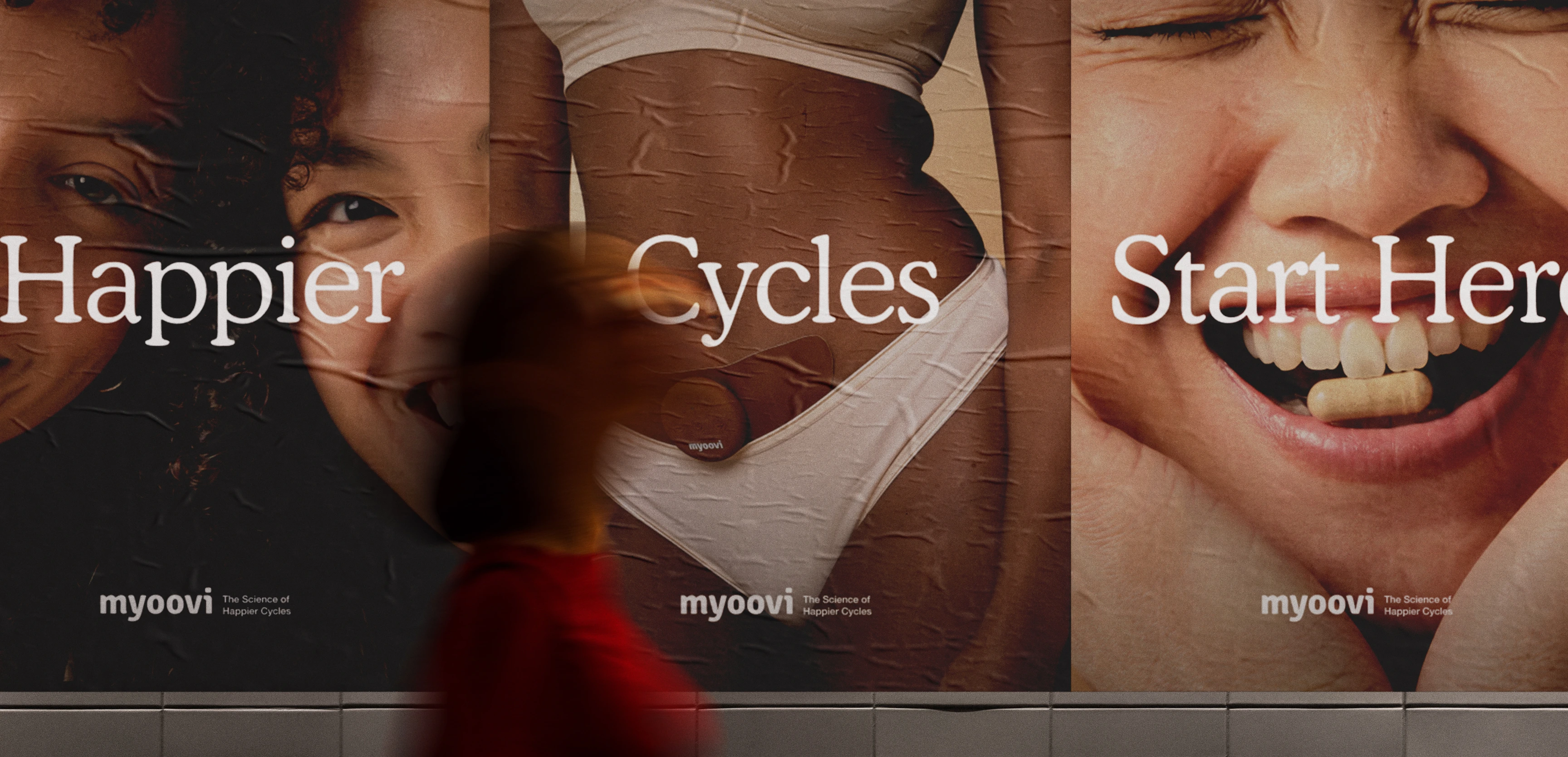
Only 17% of adult women feel they have enough knowledge about menstrual wellbeing – that’s why Myoovi was created. Holistic hormonal healthcare and education to aid happier cycles and improve all areas of your health – from stress levels, to digestion and brain function.
Floral brand imagery was created to intertwine throughout the rebrand to embody feminitiy. The choice of flowers is purposeful and symbolic, representing the reproductive part of plants. This concept felt fitting and formed a meaningful connection within the redesign choices.
Visual Identity & brand guidelines
Website Design
CRM Design
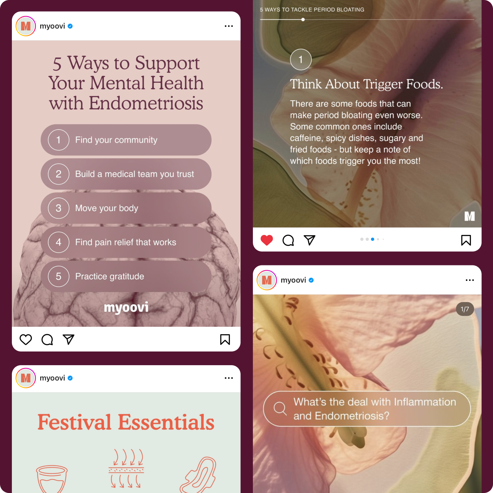
Social Design
Art Direction
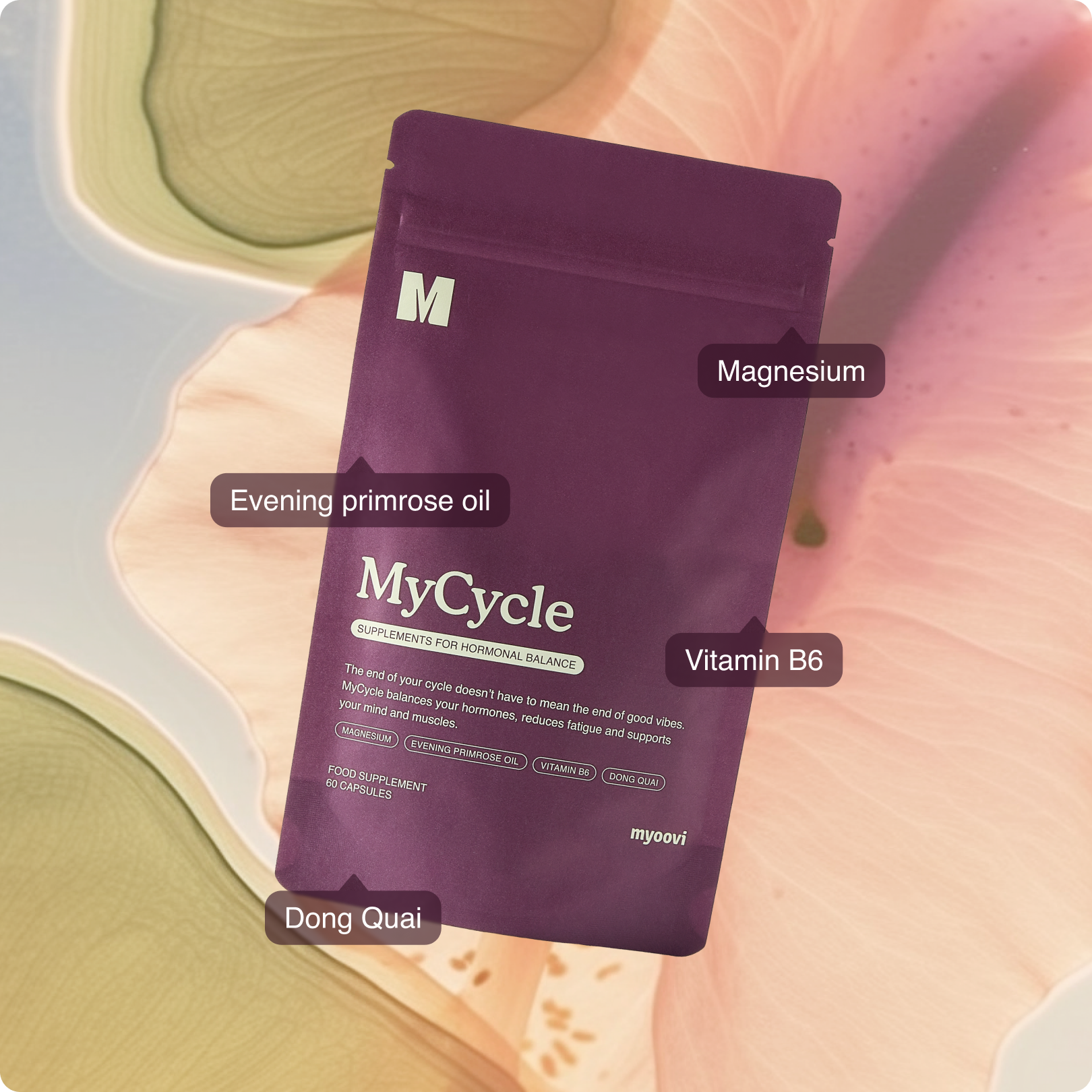
Packaging Design
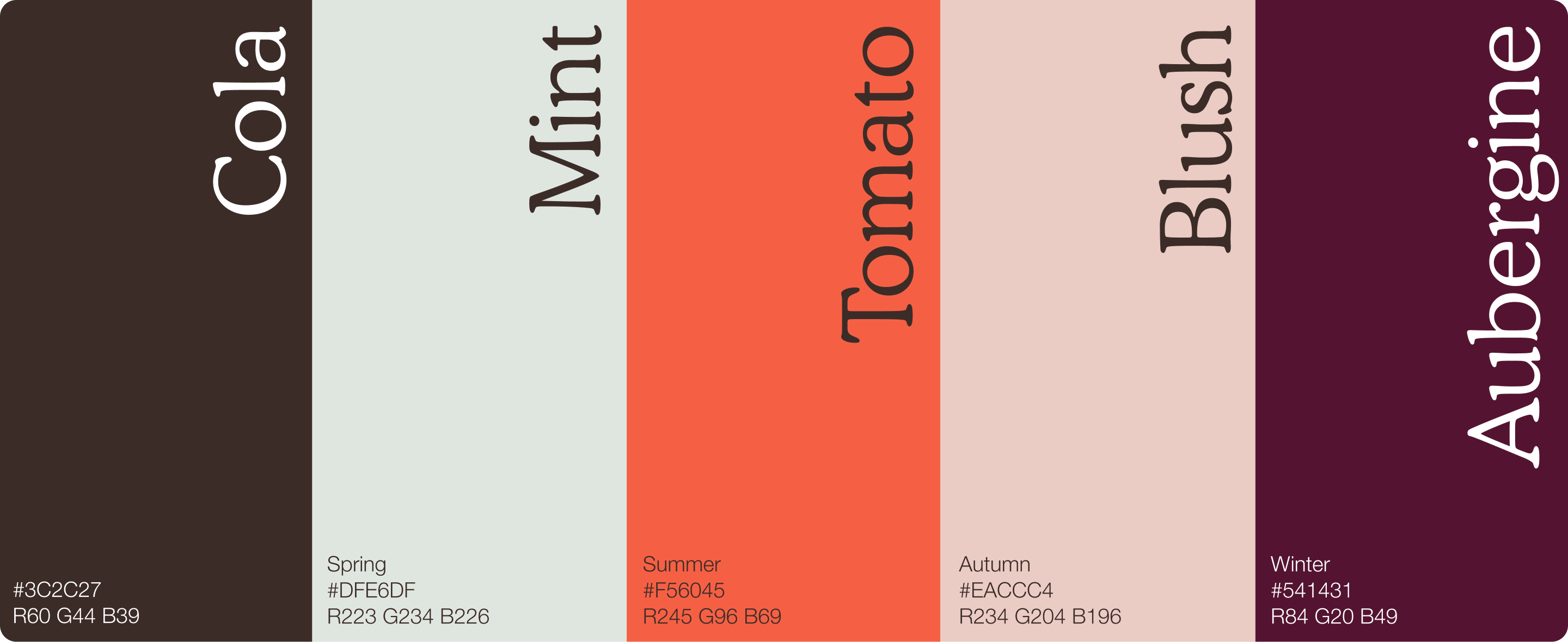
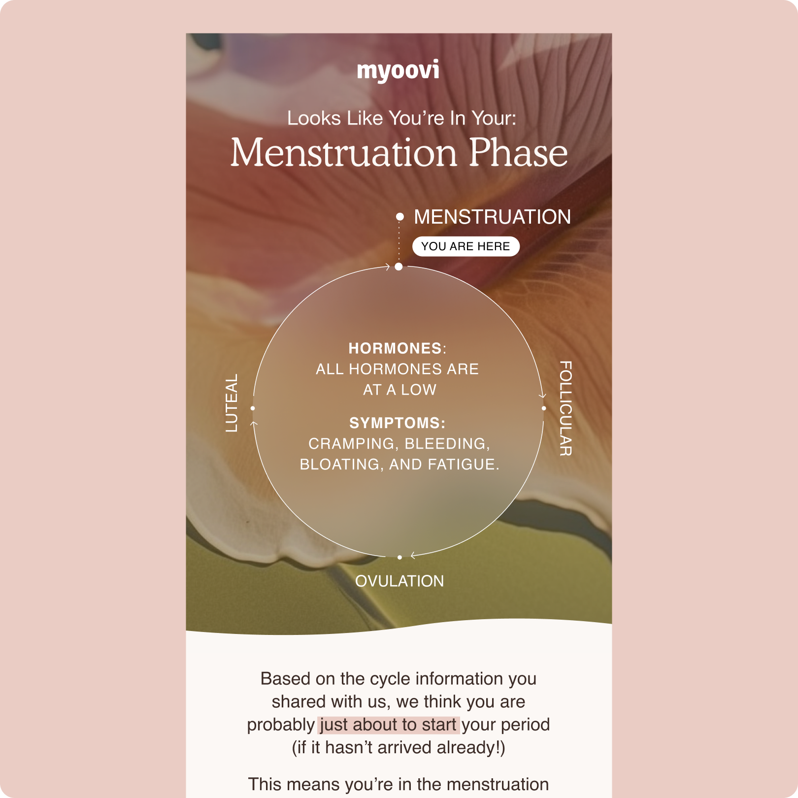
The new visual identity choices are closely tied to the female menstrual cycle, with the four primary brand colours symbolising each phase of the cycle: Mint for the Follicular Phase, Tomato for Ovulation, Blush for Luteal, and Aubergine for Menstruation.
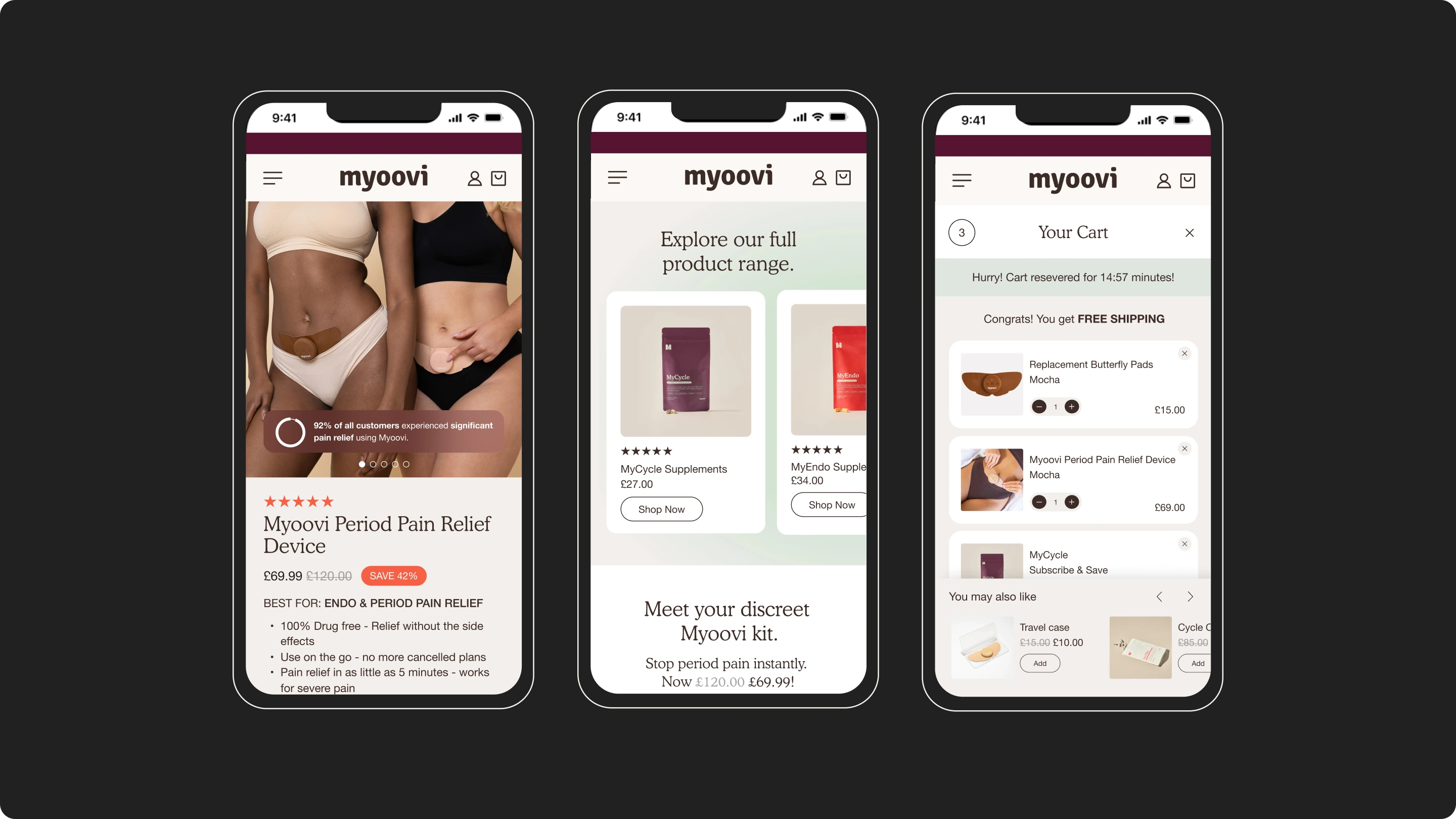

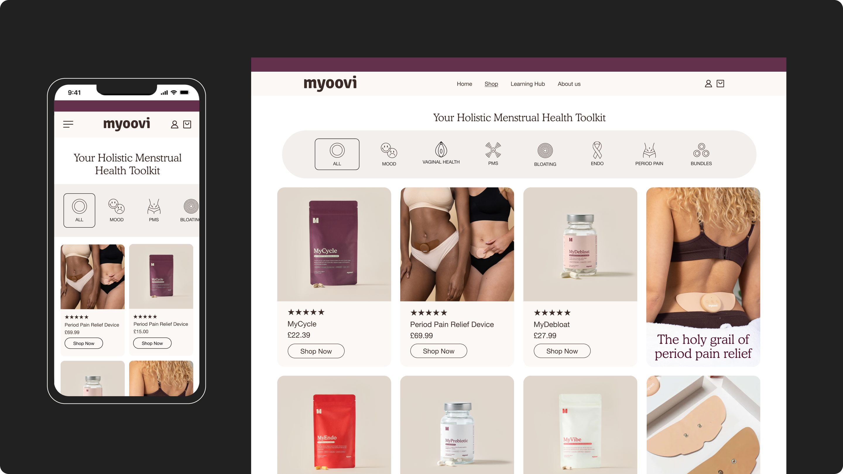
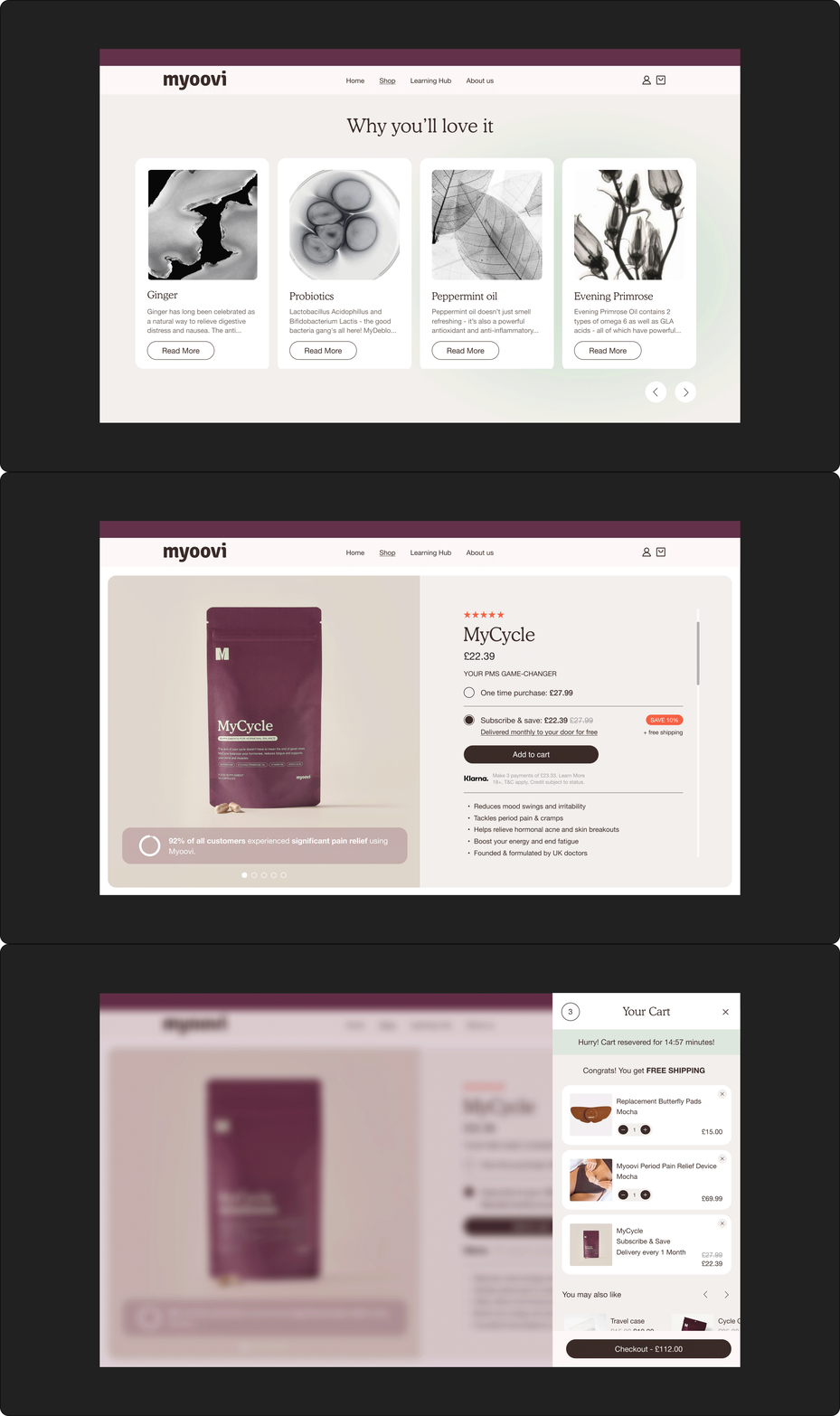
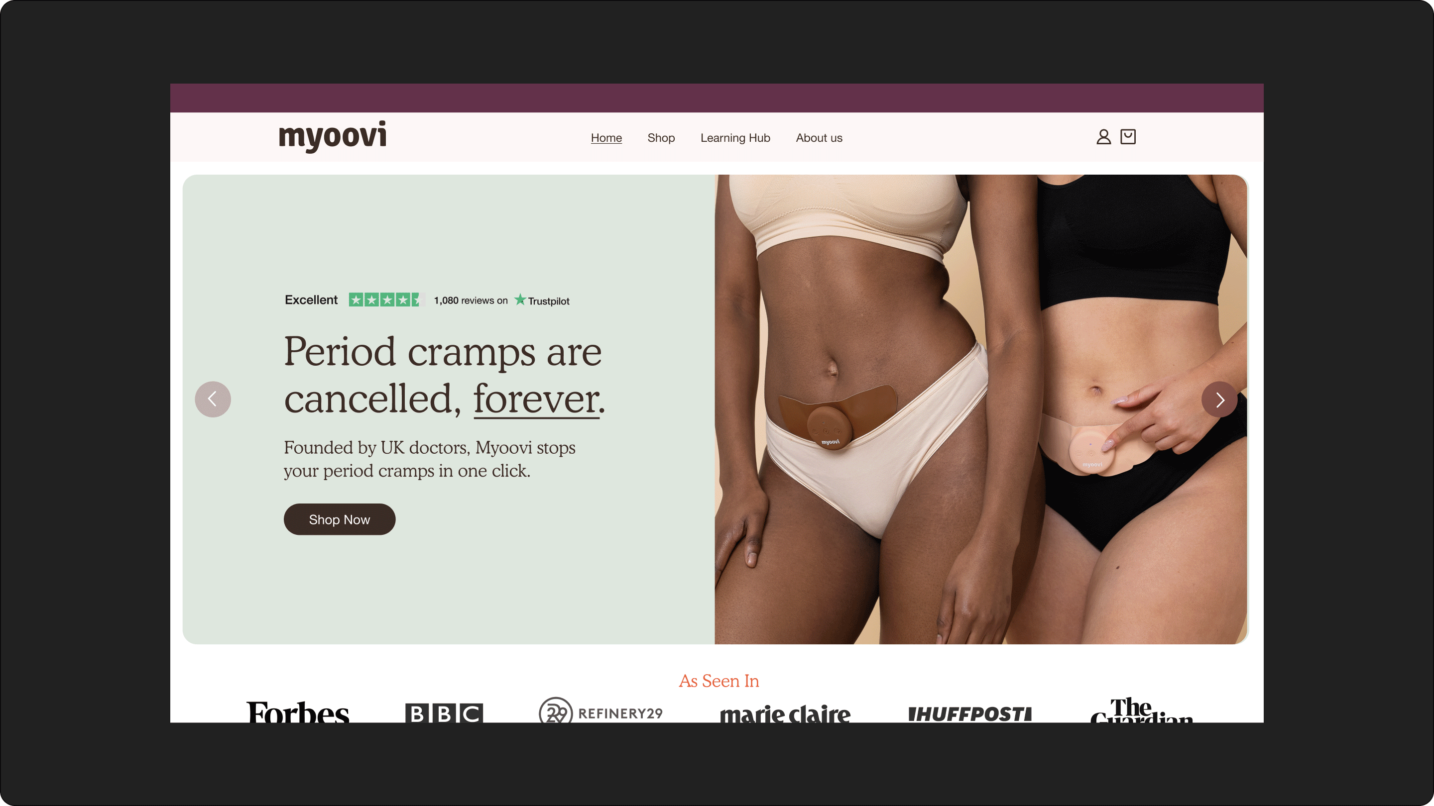
The website design includes a component-based UI kit, a full redesign and optimisation for both mobile and web, and the introduction of new features and functions throughout.

Let’s connect to see how I can bring your vision to life.


CONTACT
clarissaburridge1@gmail.com
SOCIAL

Case Study
Myoovi Rebrand
Only 17% of adult women feel they have enough knowledge about menstrual wellbeing – that’s why Myoovi was created. Holistic hormonal healthcare and education to aid happier cycles and improve all areas of your health – from stress levels, to digestion and brain function.
Floral brand imagery was created to intertwine throughout the rebrand to embody feminitiy. The choice of flowers is purposeful and symbolic, representing the reproductive part of plants. This concept felt fitting and formed a meaningful connection within the redesign choices.
Visual Identity & brand guidelines
Website Design
CRM Design
Social Design
Art Direction
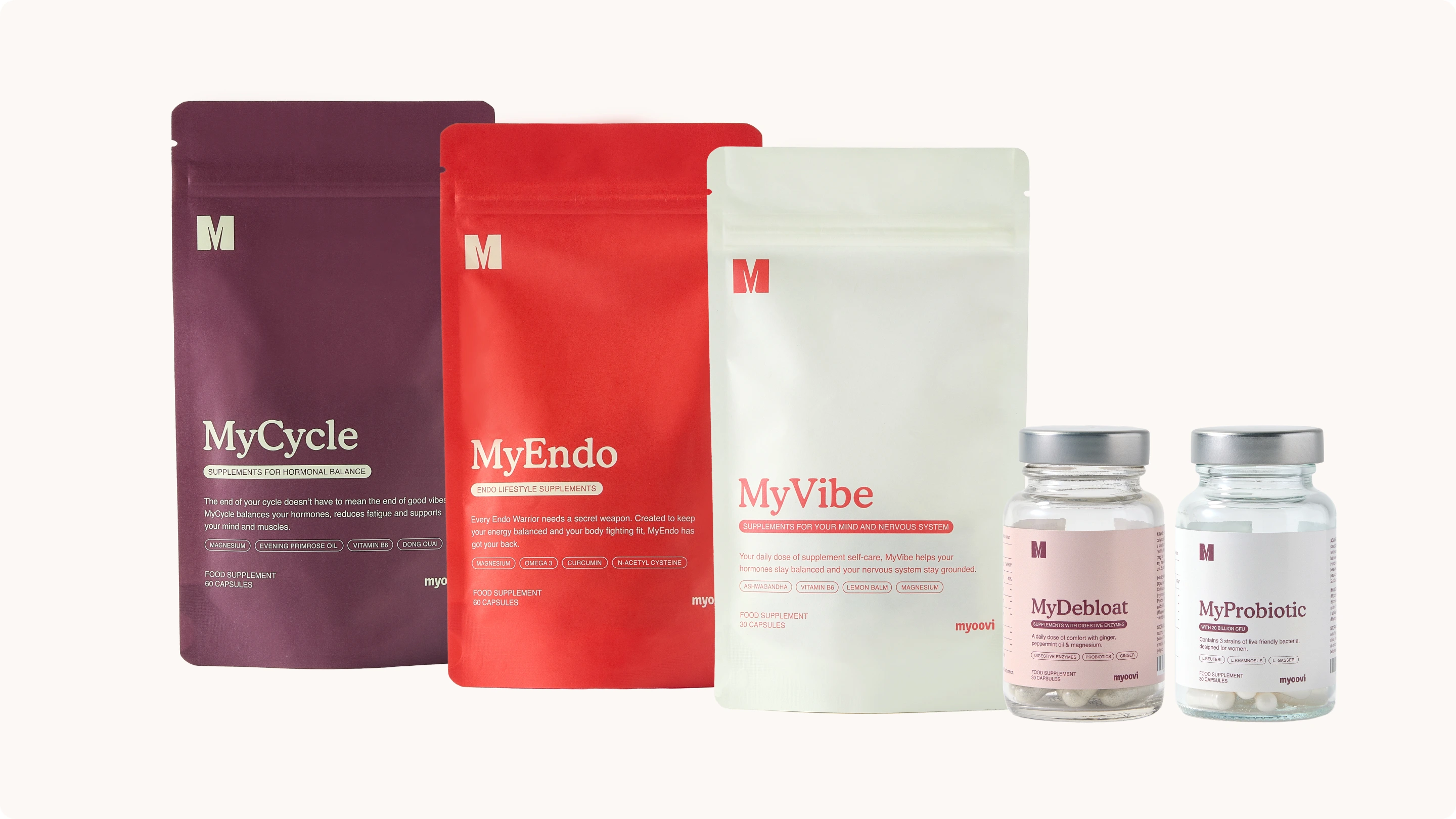
Packaging Design
The new visual identity choices are closely tied to the female menstrual cycle, with the four primary brand colours symbolising each phase of the cycle: Mint for the Follicular Phase, Tomato for Ovulation, Blush for Luteal, and Aubergine for Menstruation.
The website design includes a component-based UI kit, a full redesign and optimisation for both mobile and web, and the introduction of new features and functions throughout.

Let’s connect to see how I can bring your vision to life.


CONTACT
clarissaburridge1@gmail.com
SOCIAL


Case Study
Myoovi Rebrand
Only 17% of adult women feel they have enough knowledge about menstrual wellbeing – that’s why Myoovi was created. Holistic hormonal healthcare and education to aid happier cycles and improve all areas of your health – from stress levels, to digestion and brain function.
Floral brand imagery was created to intertwine throughout the rebrand to embody feminitiy. The choice of flowers is purposeful and symbolic, representing the reproductive part of plants. This concept felt fitting and formed a meaningful connection within the redesign choices.
Visual Identity & brand guidelines
Website Design
CRM Design
Social Design
Art Direction
Packaging Design
The new visual identity choices are closely tied to the female menstrual cycle, with the four primary brand colours symbolising each phase of the cycle: Mint for the Follicular Phase, Tomato for Ovulation, Blush for Luteal, and Aubergine for Menstruation.
The website design includes a component-based UI kit, a full redesign and optimisation for both mobile and web, and the introduction of new features and functions throughout.

Let’s connect to see how I can bring your vision to life.


CONTACT
clarissaburridge1@gmail.com
SOCIAL
